In 30 seconds
- Challenge
- Canal 13’s sales dashboards were built without a designer: hard to read, hard to navigate and off-brand, for salespeople who need answers fast.
- My part
- I redesigned the Power BI dashboards and the rate simulator with the three BI engineers, working within what Power BI can actually do.
- Result
- It shipped on the same data model. The salespeople told us it made them around 50% more productive.
The problem
Canal 13’s commercial area had started building its own business intelligence platforms in Power BI. Engineers built them without a designer, and it showed: the dashboards were hard to read, hard to navigate and didn’t look like Canal 13.
The people using them were salespeople who needed an answer quickly, often in front of a client.
What I did
01
Starting from Power BI’s defaults
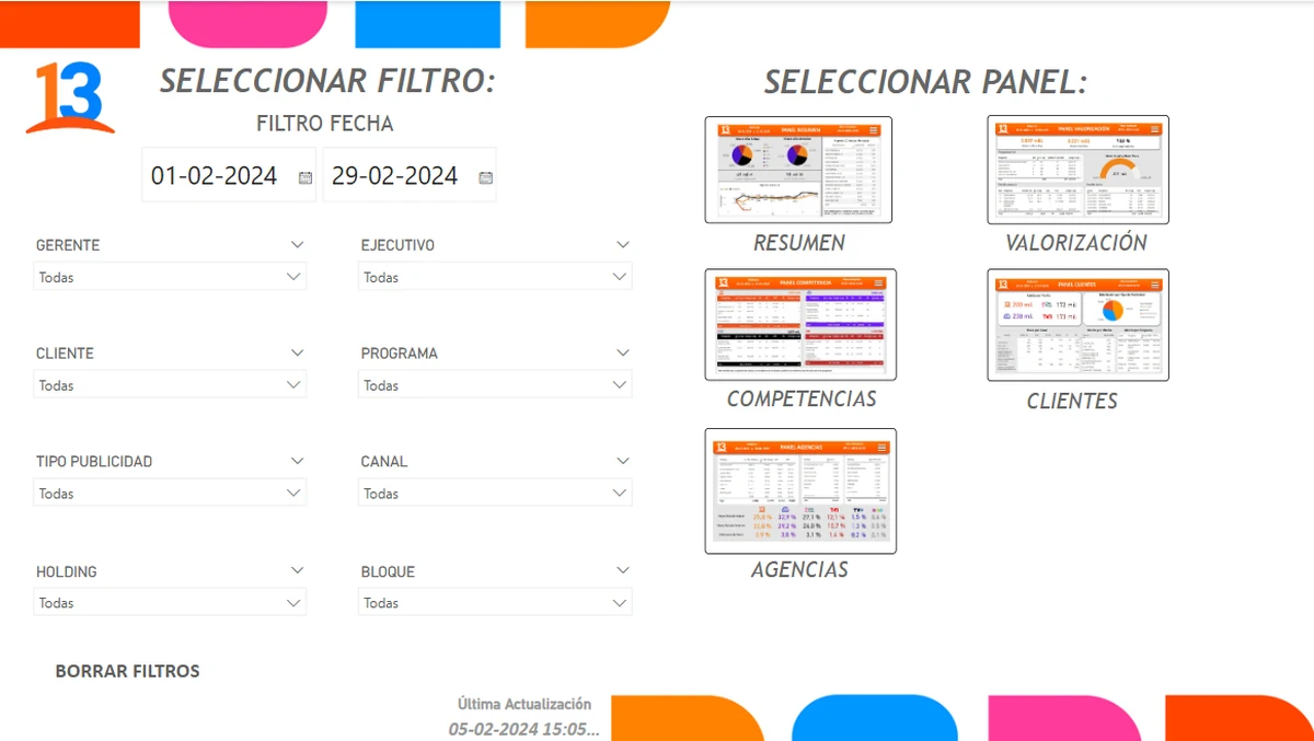
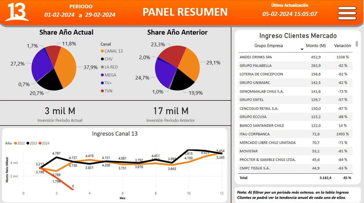
The BI engineers had built every report with Power BI’s default look: thin type, gray tables, pie charts in system colors and filters stacked in yellow boxes. The data was right, but a salesperson had to hunt for the one number they needed.
I kept the data model exactly as it was and redesigned what sits on top: one header for every panel with the period filter and the last update, the channel’s colors used to mean something (Canal 13 is always orange), and each view ordered around the question it answers. Drag each slider to see the change.
02
One way in
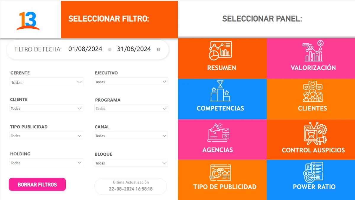
Before, the first screen was a list of filters next to a set of small thumbnails. I turned it into a home: filters on the left, and on the right one big colored tile per panel, so anyone could get to Summary, Valuation, Clients or Competition in one click.
 BeforeAfter
03
Every panel, redesigned
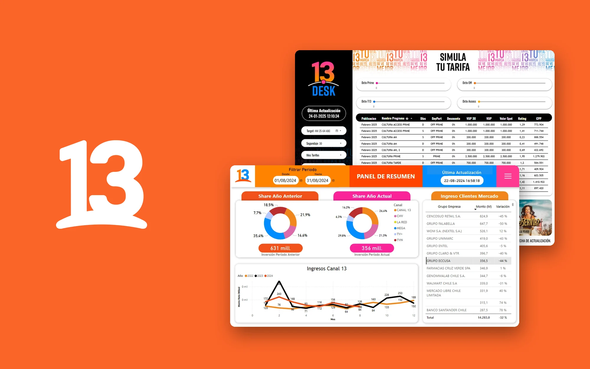
Then panel by panel. The summary now compares this year’s share with last year’s side by side, with the investment in a pill under each chart. Valuation, Clients and Competition got the same header, the same table style and the same color logic, so learning one panel means knowing them all. The same system carried over to the sponsorship control panel.
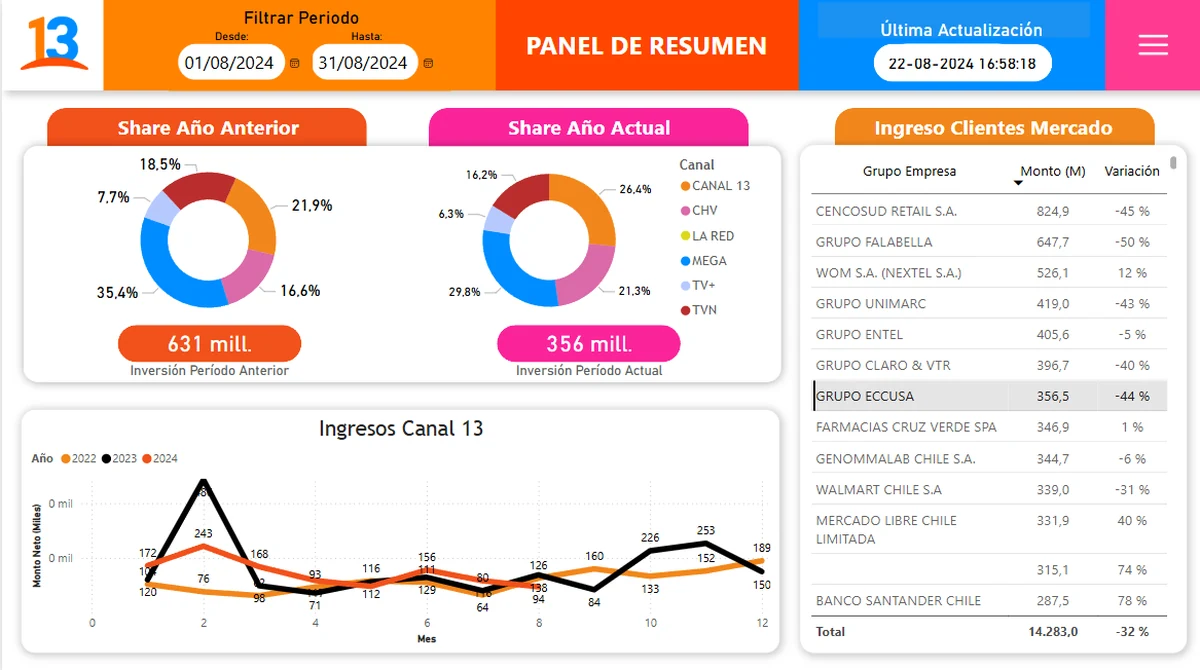 BeforeAfter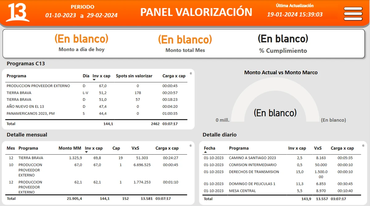
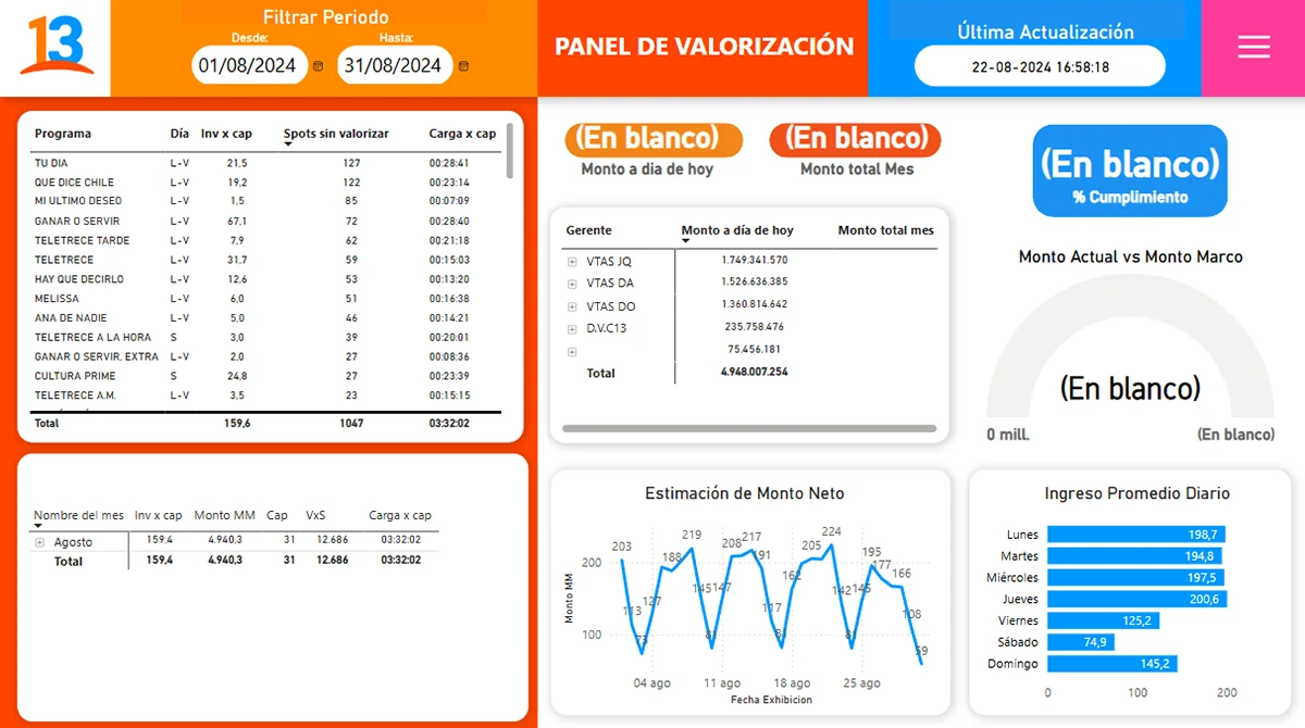 BeforeAfter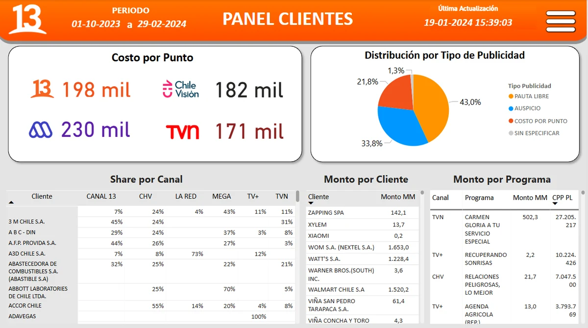
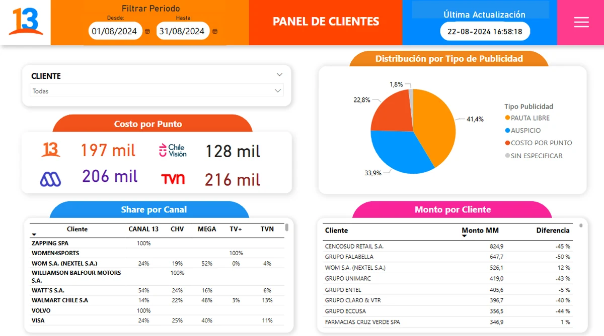 BeforeAfter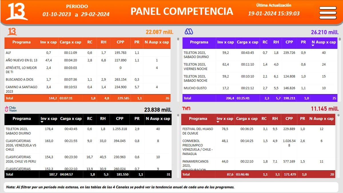
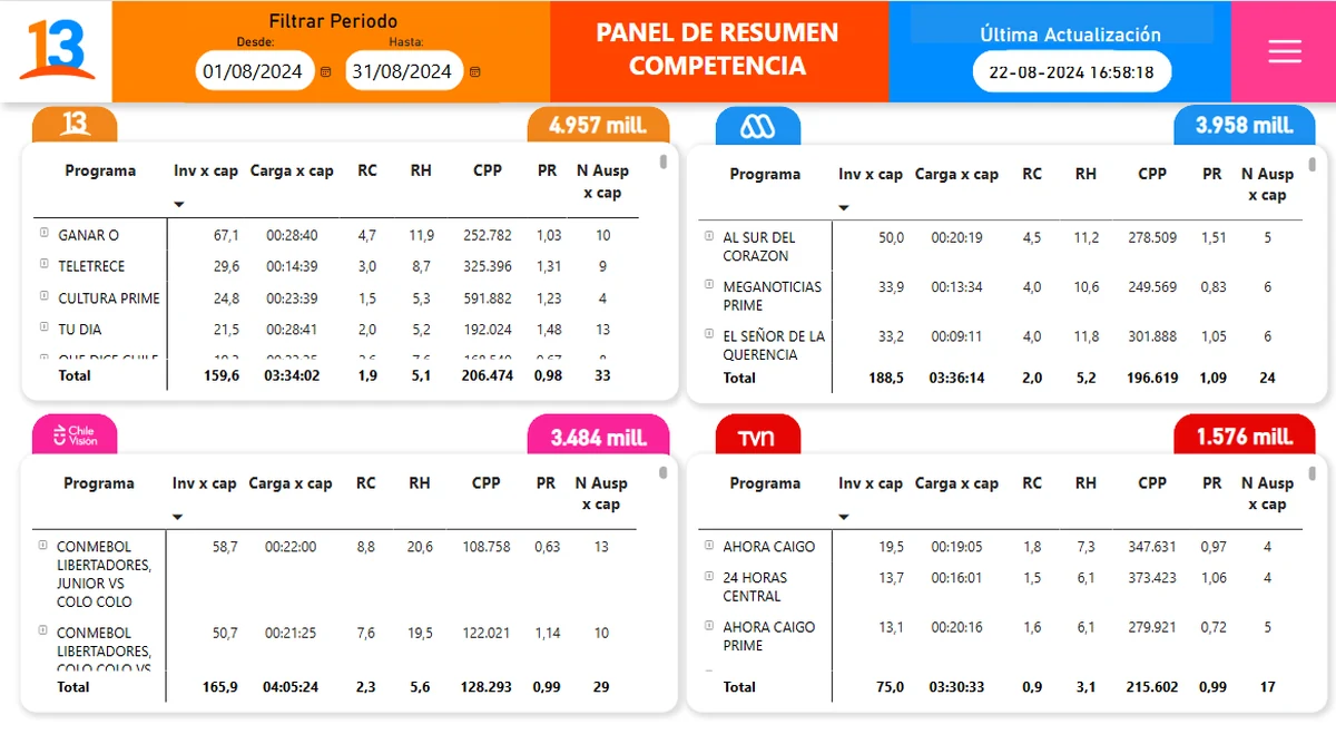 BeforeAfter
04
13Desk, the rate simulator
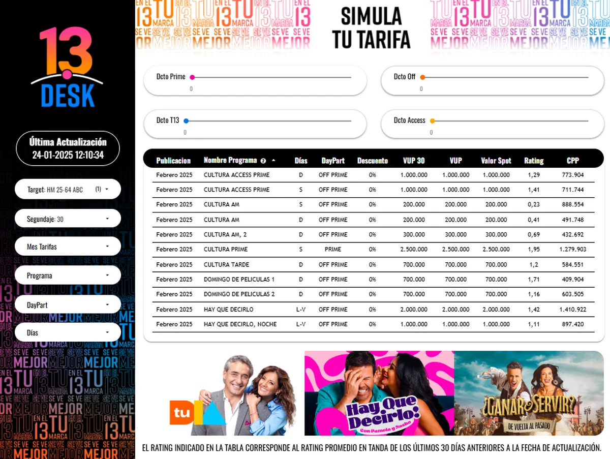
13Desk is the tool salespeople use to quote a spot while talking to a client: they choose the target, the spot length, the month and the show, set the discount for each daypart, and the table returns the value, rating and cost per point.
I gave it its own name and logo, built on the 13Comercial brand, moved the filters into a dark sidebar so the table has the whole screen, and added a strip with the current shows so it looks like Canal 13 when it’s on a laptop in front of a client.

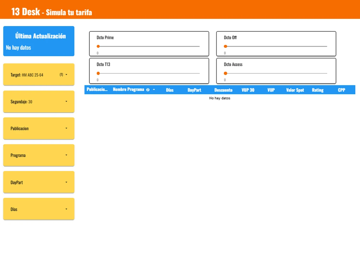
 BeforeAfter
What happened
The redesign shipped on the same data model, with no rebuild of the data layer: the three BI engineers and I designed within what Power BI can actually do.
The salespeople who used it told us it made them around 50% more productive.
- productivity, as reported by the sales team
- +50%
- panels behind one home screen
- 8
- changes to the data layer
- 0